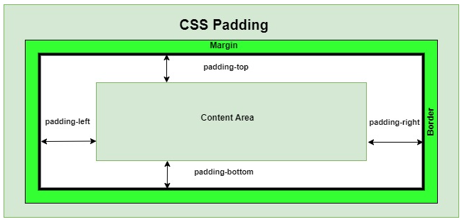
In CSS, the border is the line that goes around the padding and content of an element. It’s part of the box model.
border-top - border-right - border-bottom - border-left
border-top-width:2px ;
border-right-width:5px ;
border-bottom-width:3px ;
border-left-width:1px ;
border-width : 5px 3px ;
border-width : 5px ;
border-top-style:dotted ;
border-right-style:solid ;
border-bottom-style:double ;
border-left-style:dashed ;
border-style: dotted solid ;
border-style: solid ;
border-top-color:red ;
border-right-color:green ;
border-bottom-color:blue ;
border-left-color:yellow ;
border-color: red blue ;
border-color: blue ;
border : 1px solid red ;
border-top-left-radius: 5px ;
border-top-right-radius: 5px ;
border-bottom-left-radius: 5px ;
border-bottom-right-radius: 5px ;
border-radius: 5px 5px 0px 0px ;
The box-sizing property in CSS defines how the browser calculates the width and height of an element.
box-sizing : content-box ;
box-sizing : border-box ;
Note : add border-box in universal selector * { box-sizing : border-box ; } it changes how the browser calculates the width and height of an element.
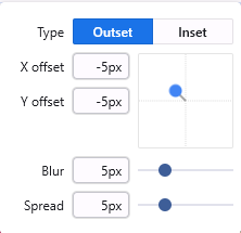
The box-shadow property adds shadow effects around an element’s box. You can set the [Horizontal - Vertical - Blur - Spread - Color - Inset].
width: 200px;
height: 200px;
background-color: violet;
border-radius:22px ;
box-shadow: -5px -5px 5px 5px rgba(114, 114, 114, 0.493) ;